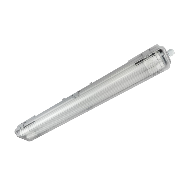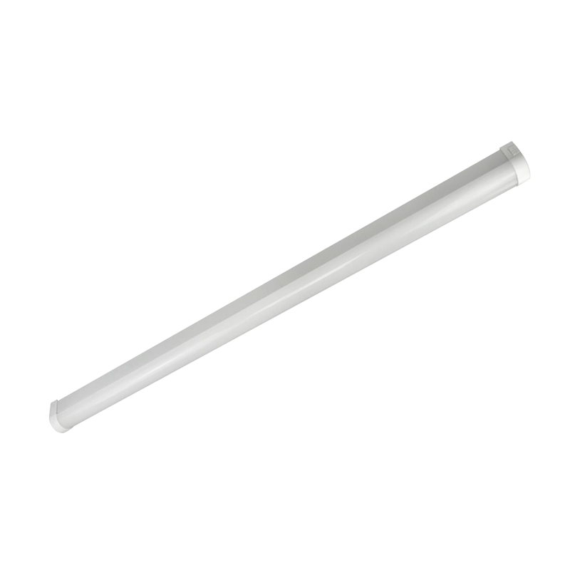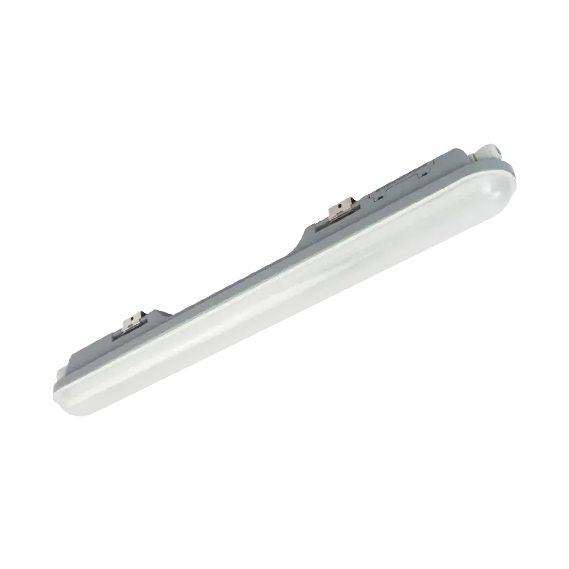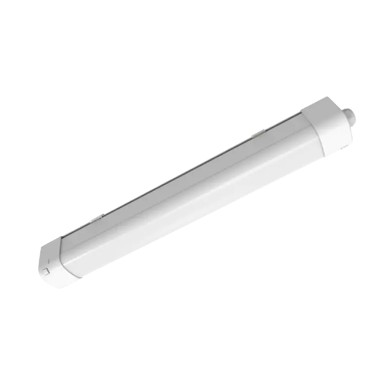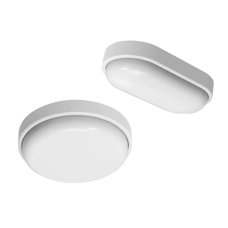


A project engineer swaps a batch of 4000K tri-proof lights for 6500K units with the same wattage and the same lumen output. The warehouse aisle immediately looks brighter. The lux meter on the work plane reads exactly what it read last week. Both statements are true, and the gap between them is where most lighting upgrade arguments begin.
The direct answer: at equal lumen output, a daylight lamp (5000K to 6500K) will almost always look brighter than a cool white lamp at 4000K. It will not deliver more light to the floor. Photopic lumens, the number printed on the box, do not change with colour temperature. What changes is how the human eye weights short-wavelength energy, how the pupil responds, how much glare the eye registers, and how the brain reads a cooler, whiter surface.
The practical rule follows from that: choose colour temperature for the appearance and comfort of a space, and choose lumens, beam angle and optics for measured brightness. Confusing those two decisions is the most common reason a lighting scheme looks wrong after installation, even when every fixture meets its datasheet claim.
One naming warning before the details. Colour temperature labels are not standardised across regions. In North America, "cool white" is frequently used for 4000K to 5000K products, while "daylight" covers 5000K to 6500K. In Europe and much of Asia, cool white almost always means 4000K and daylight means 6000K to 6500K. Work from the Kelvin figure and the binning tolerance, never from the label on a catalogue page.
Correlated colour temperature (CCT) describes the colour of white light, measured in Kelvin. Lower values look warm and amber. Higher values look crisp and slightly blue. The scale below shows where the commercial bands sit, from hospitality interiors through to heavy industry.
Brightness itself is a photometric quantity, not a colour property. Lumens measure total light output, lux measures how much light lands on a surface, and luminance measures how bright a surface or source appears per unit area. Colour temperature sits outside all three, which is why a 6500K fixture and a 4000K fixture with identical lumen ratings can look dramatically different in the same room.
| CCT band | Common label | Scotopic to photopic ratio, typical | Apparent brightness at equal lumens | Where it is usually specified |
|---|---|---|---|---|
| 2700K to 3000K | Warm white | About 1.2 to 1.3 | Baseline | Hospitality, residential, decorative retail |
| 3500K | Neutral white | About 1.4 | Slightly above baseline | Offices, healthcare, premium retail |
| 4000K | Cool white in Europe and Asia, neutral in North America | About 1.5 to 1.6 | Noticeably brighter | General commercial, corridors, warehousing, indoor parking |
| 5000K | Daylight, and often cool white in North America | About 1.8 to 1.9 | Clearly brighter | Industrial floors, food areas, laboratories, back of house |
| 5700K to 6500K | Daylight | About 2.0 to 2.2 | Brightest appearance | Heavy industry, inspection, tunnels, high bays, cold climate outdoor |
Read the fourth column carefully, because it explains a conversation that happens on almost every industrial fit-out. A client stands in a freshly installed aisle and asks why the daylight scheme feels harsher and more clinical than the cool white scheme, even though the photometric calculation reports identical lux values on the racking face. Nothing is wrong with either design. The colour temperature changed the perception, not the photometry.
Most disputes about cool white versus daylight disappear once the vocabulary is fixed. Four measurements sit behind the word "bright", and only two of them are affected by colour temperature.
Lumen output (lm)
The total light emitted by the luminaire, weighted to the eye's daylight response. It is fixed by the LED package, drive current and optics, and it does not change when you select a different CCT at the same wattage.
Illuminance (lux)
Lumens arriving at one square metre of surface. This is what lighting design software predicts and what a lux meter confirms. It is the number your standard or client brief is actually written around.
Luminance (cd/m2)
Light emitted or reflected per unit area in a given direction. The eye reads luminance, not lumens. A small, bright aperture at the same lumen output will always look brighter and will always cause more glare.
Perceived brightness
The subjective result that combines luminance, spectrum, pupil size, adaptation state and the contrast of surrounding surfaces. This is the only one of the four that shifts meaningfully with colour temperature.
A practical example: two battens both rated at 4,000 lumens, one with a 120 degree beam and one with a 60 degree beam. The narrow version concentrates the same energy into roughly a quarter of the solid angle, so the peak luminance rises and the fixture looks far brighter from directly underneath. The uniformity across the aisle drops, shadowing between rack legs increases, and glare complaints follow. Colour temperature played no part in that outcome, yet the installer will describe it as "the brighter fitting".
That is why meaningful comparisons always hold optics constant. If you want to know whether daylight or cool white is brighter, compare two fixtures from the same product family, at the same wattage, same lumen output, same beam angle, same diffuser and same mounting height. Change only the Kelvin value.
The explanation is part physiology and part expectation, and both matter when a space is handed over to its users.
Photopic lumens are defined by a sensitivity curve that peaks in the green-yellow region around 555 nanometres. Light at 6500K contains proportionally more short-wavelength energy below 500 nanometres than light at 4000K. That extra blue content increases the scotopic and melanopic weighting of the spectrum, which is usually expressed as the scotopic to photopic ratio. Typical values move from roughly 1.5 at 4000K to around 2.1 at 6500K, meaning the daylight spectrum carries roughly 35 to 40 percent more scotopic lumens for the same photopic output.
That headline figure is often quoted as though the eye simply gains 35 percent brightness. It does not work that way in a lit interior. Under bright conditions the pupil constricts, which reduces the contribution of rod-driven vision and narrows the gap. Measured perceptual gains at work-plane illuminances above 300 lux are usually a few percent to around ten percent, and they grow larger in dim conditions, such as a night-time car park, a stair core or a corridor. In very dim spaces the advantage of a blue-rich spectrum becomes obvious; in a fully lit production hall it becomes subtle.
Illustrative perceived-brightness index at equal lumen output and equal optics
Index values are illustrative and intended for comparison only. They are not a substitute for a photometric calculation or an on-site measurement.
Human vision adapts within roughly two to five minutes. Put one person under 4000K and another under 6500K in separate rooms for ten minutes, then swap them, and both will report that the room looks normal. The difference only feels dramatic when both colour temperatures sit in the same field of view, or when someone walks directly from one into the other.
Surface colour reinforces the impression. Grey concrete, galvanised racking, cardboard packaging and painted walls all read cooler and cleaner under a higher CCT. A space full of grey-brown industrial surfaces genuinely looks lighter under 6500K, even though the reflected lux value is unchanged. In food preparation areas, inspection benches and back-of-house corridors, that effect is often exactly what the client wants. In a hotel lobby or a furniture showroom, the same effect makes timber look grey and skin look flat.
Running cost is dominated by wattage, driver efficiency, optical transmission, thermal design and how the fixtures are controlled. Colour temperature sits far down that list, but it is not irrelevant, and the direction of the effect surprises people.
White LEDs are blue emitters with a phosphor layer that converts part of that blue light into longer wavelengths. Producing 3000K requires more phosphor conversion than producing 6500K, and every conversion step loses energy. For that reason, a high-CCT LED can be marginally more efficient than a low-CCT LED built on the same platform. Between 4000K and 6500K the difference is normally within single digits and can disappear entirely once binning, phosphor blend and drive current are taken into account. In some product families it runs the other way, because the 6500K version is driven harder to hit a target lumen figure.
What this means commercially is simple. Do not select daylight white expecting an energy saving, and do not avoid it expecting a penalty. If the project has a hard energy target, the levers that matter are the ones covered by high-efficiency linear designs, where board layout, diffuser transmission and thermal path do the real work. That is a more productive conversation than a debate about Kelvin.
| CCT band | Typical luminaire efficacy | Melanopic ratio, approximate | Practical note |
|---|---|---|---|
| 3000K | 110 to 150 lm/W | About 0.45 | Best warmth and material appearance, lowest blue content |
| 4000K | 120 to 160 lm/W | About 0.60 | The default for most commercial interiors |
| 5000K | 120 to 165 lm/W | About 0.75 | Industrial and technical spaces, high visual clarity |
| 6500K | 115 to 160 lm/W | About 0.90 | Highest perceived brightness, highest blue content |
Driver choice matters more than most specifiers expect. A constant-current driver running at 88 percent efficiency versus one at 82 percent changes system wattage more than a 500K colour shift. Flicker behaviour, dimming compatibility and surge protection all live in the driver, and they decide whether a daylight scheme feels crisp or fatiguing after a full shift.
Daylight white earns its place in industrial and technical environments, but it is not a free upgrade. These are the effects that show up after handover rather than on the specification sheet.
Cool white, 4000K
Comfortable as a general-purpose interior light. Balanced blue content, predictable colour rendering, low complaint risk in offices and clinics. Perceived brightness advantage over 3000K is real but moderate.
Best when people work under it for eight hours or more.
Daylight, 5000K to 6500K
Maximum perceived brightness and visual clarity. Strong on grey industrial surfaces, dust and fine detail. Higher glare sensitivity, higher melanopic load, and more demanding colour rendering requirements.
Best for technical tasks, inspection, high bays and short-dwell circulation areas.
The pattern in professional practice is consistent: daylight white wins where the task is visual and the dwell time is short, cool white and neutral white win where people stay and comfort matters. The table below reflects common commercial practice rather than a single mandatory standard, and every figure should be checked against the project specification and local requirements.
| Space | Recommended CCT | Typical maintained illuminance | Reasoning |
|---|---|---|---|
| Warehouse racking aisles | 4000K to 5000K | 100 to 150 lux | Label reading and fork truck safety, with glare kept away from eye level |
| Heavy assembly and workshop | 5000K | 300 to 500 lux | Detail visibility and alertness over a full shift |
| Food processing and inspection | 5000K to 6500K, CRI 90 | 500 to 750 lux | Contaminant and defect detection on pale surfaces |
| Open-plan office | 3500K to 4000K | 500 lux | Screen comfort, low glare, occupant acceptance |
| Retail sales floor | 3000K to 4000K, CRI 90 | 300 to 500 lux | Merchandise colour and material appearance |
| Indoor car park | 4000K to 5000K | 75 to 100 lux | CCTV clarity and wayfinding in a low-dwell space |
| Corridor and stair core | 4000K | 100 lux | Comfort at close range and low glare from wall or ceiling units |
| Gymnasium and sports hall | 4000K to 5000K | 300 lux | Fast movement and ball tracking without harsh contrast |
| Loading dock and canopy | 5000K | 150 to 200 lux | Vehicle movement and paperwork at night |
| Healthcare examination room | 4000K to 5000K, CRI 90 | 500 lux | Skin and tissue assessment with accurate colour |
Zoning a building across two colour temperatures is acceptable when the zones are separated by a door or a change of level. It becomes a problem when a worker standing at a machine can see a 6500K hall through a doorway and a 4000K canteen at the same time, because the eye cannot adapt to both at once and one area will always look wrong.
Colour temperature is the second-most-argued variable in a lighting comparison. The first is distribution. Two luminaires with identical lumen output and identical CCT can produce completely different impressions of brightness if their optics differ, and this is where a lot of specification mistakes are made.
A 120 degree beam angle spreads light broadly along an aisle, which reduces peak luminance on the diffuser and improves uniformity on the floor. A narrower distribution raises the intensity directly below the fixture and drops it between rows. In practice, a wide distribution at 6500K and 4,000 lumens will usually feel calmer than a narrow distribution at the same output, even though the second one measures a higher peak illuminance at a single point.
Diffuser design has a similar effect. A slim linear batten with a well-diffused opal cover keeps the surface luminance low and spreads light evenly along a corridor or workshop row, which is exactly what a daylight CCT needs to stay comfortable. Harsh, visible light sources at high CCT create the clinical, glaring effect that gives daylight white a bad reputation in interior projects. The colour temperature is rarely the real culprit; the source luminance is.
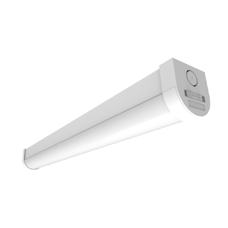
 LG15D 120° Beam Angle Slim LED Batten Fitting IP20Model No. LG15D-06-10/20 LG15D-12-20/40 LG15D-15-30/60 LG15D-18-40/75 Dimensions(mm) 600*63.5*65 1200*63.5*65 1500*63.5*65 1800*63.5*65 Power 10/20W 20/40W 30/60W 40/7...View Product →
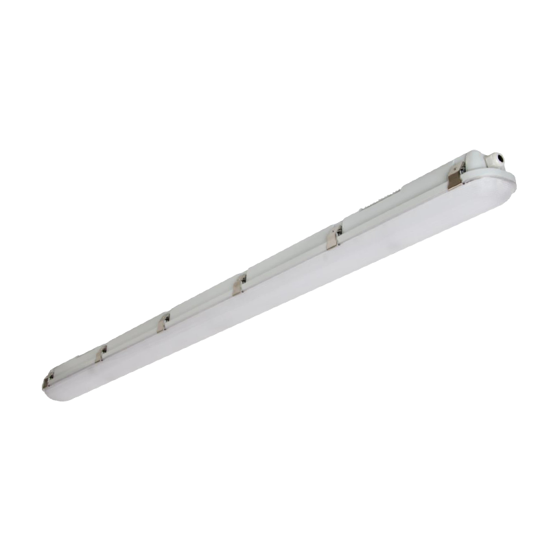
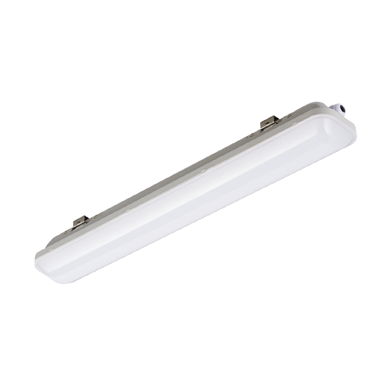
For linear applications, a slim profile with a 120 degree beam and an IP20 rating covers most indoor industrial and commercial runs, including workshops, storage areas and corridors. When a space is dusty, wet or washed down, that specification has to move up to a sealed tri-proof body with a higher IP rating, and the photometric performance should be re-checked rather than assumed. This is also the point where verified test data matters: a witness laboratory report behind the LM-79 file tells you the lumen and colour claims were measured on the actual production build, not extrapolated from a laboratory sample.
Flat panel luminaires behave differently from linear battens, because the entire ceiling surface becomes the light source. Uniformity across the panel face matters as much as lumen output, and a backlit construction that spreads the LEDs behind a wide diffuser avoids the bright edge and dim centre that cheap edge-lit panels show. In a 4000K office, a well-built panel at 500 lux is comfortable. A 6500K panel at the same output in the same ceiling often triggers complaints within a week, not because the light level changed, but because the luminance contrast between the panel face and the surrounding ceiling became more noticeable to the eye.
 LG23A Multi-size Function Optional Backlit PanelModel No. LG23A-2X2FT-40 LG23A-1X4FT-40 LG23A-2X4FT-50 Dimensions(inch) 23.8*23.7*1.4 47.8*11.9*2.7 47.8*23.7*1.4 Power 25/30/40W 25/30/40WView Product →
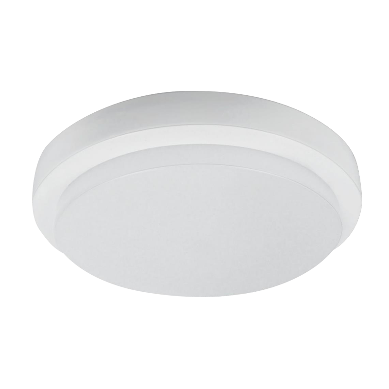
Wall-mounted and surface fixtures have their own constraints. In corridors, stairwells and entrances, the eye is often close to the light source, so the discomfort threshold drops sharply. An adjustable, anti-glare, dimmable indoor bulkhead gives the installer a way to aim light down a wall or along a route while keeping the high-luminance aperture out of the direct line of sight. At 6500K, that control is not optional. At 4000K, it is still good practice.
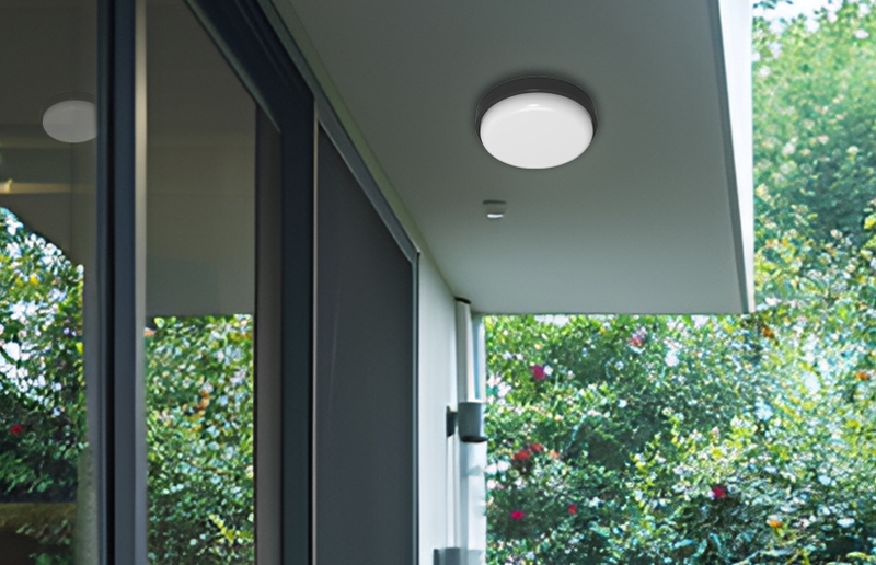 LG19D Adjustable Anti-glare Dimmable Indoor LED BulkheadModel No. LG19D-180T LG19D-210T LG19D-150Y LG19D-190Y Dimensions(mm) 180*95*48 210*105*48 150*150*48 190*190*48 Power 6/8W 12/14W 6/8W 12/14W Voltage AC220-240V CCT 27...View Product →
Where a project needs to run both a comfort zone and a technical zone, the cleanest approach is to keep the same fixture platform and change only the CCT and the driver setting. Series-based product families make this practical for maintenance teams, because the same spare parts, mounting brackets and installation method apply across the whole building, and the only difference on site is the label on the carton. Ask any supplier for the CCT options available across an entire series before committing to a mixed-temperature scheme.
Side-by-side comparisons in a showroom are unreliable unless the method is controlled. These steps produce a decision that survives handover.
Bring a lux meter
A 30 second measurement removes most of the argument. Perceived brightness is subjective; illuminance is not.
Bring a colour sample
A piece of the actual product, packaging or material under consideration shows what each CCT does to real colour.
Bring the operators
The people working eight hours under the light make a better decision than anyone reading a datasheet at a desk.
If two quotations differ on colour temperature but agree on everything below, the CCT decision is straightforward. If they differ on the items in this table, the CCT debate is a distraction from the real gap in quality.
| Parameter | What to ask for | Why it decides the result |
|---|---|---|
| Lumen output and tolerance | Rated lumens with a stated tolerance, from an LM-79 test | Determines achievable lux and how many fixtures are needed |
| CCT and binning | Kelvin value plus SDCM, for example 4000K at 3-step | Prevents tint mismatch between fixtures and between batches |
| Colour rendering | CRI and the individual R9 value | Separates acceptable lighting from lighting that flatters the task |
| System efficacy | lm/W at the luminaire, not the LED package | Drives running cost and confirms the driver is matched properly |
| Beam angle and distribution | Photometric file in IES or LDT format | Lets you model uniformity and glare before purchase |
| Luminance and glare control | UGR data or measured diffuser luminance | The main source of complaints in high-CCT installations |
| Lumen maintenance | L70, L80 or L90 figures with the test conditions | Defines how the space will look in year three, not year one |
| Driver and flicker | Driver brand class, dimming protocol, percent flicker | Affects comfort, camera behaviour and control compatibility |
| Ingress and impact rating | IP and IK ratings matched to the environment | Determines whether the photometry survives dust and washdown |
| Serviceability | Replaceable driver and light source availability | Extends the life of the installation and reduces waste |
| Warranty and support | Written terms with response commitments | Protects the project long after the lighting contractor leaves site |
Manufacturers with in-house testing capability, accredited witness laboratories and active participation in industry standards work are usually the ones able to supply these documents without a long delay. That matters more in high-CCT projects, because colour consistency and glare behaviour are exactly where unverified claims break down.
The most expensive version of this decision is the one made on a datasheet alone. Installing one aisle at each colour temperature and letting the operators choose is the fastest way to a scheme that is accepted rather than merely compliant.
Daylight white looks brighter. At the same lumen output and the same optics, a 6500K source carries more short-wavelength energy, which raises the scotopic and melanopic weighting of the spectrum and increases perceived brightness by roughly a few percent to around ten percent in a normally lit interior. Measured illuminance on the work plane does not change at all, because that is set by lumens, beam angle and mounting height.
It looks brighter, but the lumen output is effectively unchanged. Wattage fixes input power, not light output, and the two fixtures may differ slightly in efficacy depending on phosphor blend and driver. In most commercial products the lm/W difference between 4000K and 6500K is within single digits, so the practical brightness change comes from perception and glare behaviour rather than from additional light.
Not consistently, and the answer depends on region. In Europe and much of Asia, cool white normally means 4000K and daylight means 6000K to 6500K. In North America, cool white is often used for 4000K to 5000K and daylight for 5000K to 6500K. The only reliable approach is to quote the Kelvin number and the binning tolerance in the specification.
No. CCT describes the colour appearance of white light, not its full spectral power distribution. A 6500K LED does not reproduce the spectrum of the sun, which is continuous and includes ultraviolet and infrared. Daylight CCT fixtures are only "daylight-like" in colour tone, and their colour rendering quality still depends on phosphor design and the resulting CRI and R9 values.
Between 4000K and 5000K for most racking aisles, with maintained illuminance around 100 to 150 lux and glare kept out of the eye line. Daylight white above 5000K suits inspection areas, loading docks and high bays where visual clarity is prioritised and dwell time at close range is short. Sealed tri-proof housings are the usual choice where dust and moisture are present.
Yes, provided the zones are visually separated by a wall, door or change of level. The eye cannot adapt to two colour temperatures in one field of view, so a 6500K production hall seen through a doorway from a 4000K office will always make one of the two spaces look wrong. Keep the same fixture family across both zones to simplify spares and maintenance.
Generally not above 5000K in large areas. Occupants in open-plan offices usually accept 3500K to 4000K far better over a full working day. Higher CCT increases melanopic load and perceived glare, and the added visual crispness rarely compensates for the discomfort reported after several hours. If alertness is the goal, use higher CCT selectively in break areas or on morning-shift tasks rather than across the whole floor.
It can, but automatic white balance usually hides it. Cameras with auto white balance neutralise a colour temperature shift, so CCTV footage from a 6500K car park may look similar to a 4000K one. For product photography and quality inspection, lock the white balance to a fixed value and check the colour rendering of the light source, because a high CCT with a low R9 will visibly flatten red tones.
At the same luminance, yes. Blue-rich light produces a stronger glare sensation and greater discomfort, particularly when the source is close to the line of sight or set against a dark background. The fix is optical rather than thermal: use a diffused source with controlled luminance, recessed or shielded mounting, and a CCT that suits the space rather than the maximum value available.
Ask for the LM-79 report for the exact model, the CCT binning in SDCM steps, the individual CRI and R9 values, the photometric file for modelling, driver details including dimming and flicker performance, and the lumen maintenance projection. Then request two sample fixtures, one per colour temperature, for a week-long on-site comparison with a lux meter. That process resolves the cool white versus daylight question faster than any datasheet comparison.
For projects that run across several product families, whether linear battens, panels, bulkheads or sealed tri-proof bodies, the practical approach is to keep the optical platform constant and vary the CCT and driver settings to suit each zone. That keeps installation, spares and maintenance straightforward while still giving every space the colour appearance its task requires.



No.8, Ankang West Road, Zonghan Street, Cixi City, Zhejiang Province, P.R.China
0086-574-6320 0283
Copyright © Ningbo Longer Lighting Co., Ltd.
All Rights Reserved.
 Wholesale LED Lighting Fixtures Manufacturers

 Deutsch